Saturday, December 31, 2016

Wedding trends for 2017 - Cosmic color palette

Our blog focuses on providing up to date info and ideas on the latest news and trends in the events industry. We want to inspire our students and our clients across the country and even around the world to create and inspire the most exquisite events and weddings dreams are made of. For information on our latest courses and specials visit our website www.ectaint.com or follow the links to DrapingWedding Planning and Decor courses. We offer in-class, correspondence and for our internet addicted students, online. Enrol today! For our video tutorials, please click here


Wedding colors 2017 - Cosmic color palette.


This is the year of aurora borealis - cosmic color palette. According to Eclectic trends - 
http://www.eclectictrends.com/my-lifestyle-trends-aw-201617-for-global-color-research-cosmic-part-iv-2/ this color palette will be visible in clothing, home decor and wedding decor. 


Eclectic trends says: "It’s a  very unusual colour palette for my blog, and even feels a bit odd to be honest, but when you talk trends, you can not just go for those you particularly like but have to have a brider vision. And it was the missing piece of the series, so here it goes:


COSMIC is pretty self-explanatory through the imagery here. Humankind has made it possible to reach the space with suborbital flights. Virgin Galactic will be the first commercial company to offer  spaceflights. Founder Sir R. Branson flew first in 2009, he has been testing and improving ever since and the first commercial flight will be scheduled in a near future. Dreaming of the wide universe and reaching it has become a bit closer.


COSMIC plays with the dark, the unknown, mystery and interacts at the same time with very shiny and bright colors. Iridescence and glitter effects are key here.


Exploding stars and Aurora Boreales give the inspiration for a new visual language with a wide color palette.

The color palette is bright, vivid and acid with pink an purple, greens and turquoise. Black and a really dark blue are the perfect backdrop for dramatic contrasts."


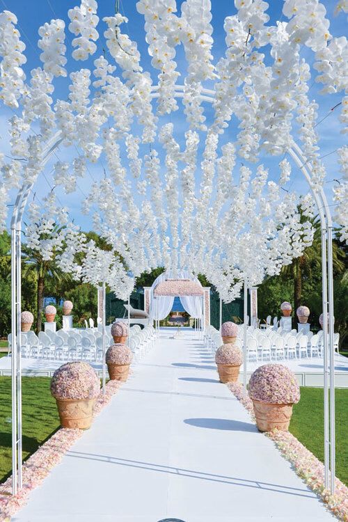
Please just remember that a color palette is only there to give you a guide line on the decor for your wedding. Don't try and bring in all the colors of a colour palette. If you are not very cautious it can look like a circus. Normally you will need to choose 3 to 5 colors of the color palette and work within those colors for your wedding.

With this color palette it is also very important to remember that you don't have to use the shiny materials that they suggest. Specially if you are not a bling kind of person. I always suggest to use the color palette only for guidance in color.

Lastly - if you google "cosmic color palette" you will get a lot of other color palettes as well. As an example:


The color palette that Pantone indicated for the year of 2017 consist of specific green, pinks, blues etc. Make sure you work in the correct colors.

Please follow our blog for a weekly moodboard and explanation of the 2017 color palette's use in wedding decor.

Happy eventing

Marieta

Photo's for this blog comes from the following websites: 


New Year 2017

Yolandi and Myself wish you a wonderful and prosperous New Year - 2017. Our prayer is that every dream you have in your personal life and your business will come to pass! Enjoy what is laying ahead and learn from what is in the past! 


Marieta Greyling, Jacques Greyling, Yolandi Greyling
ECTA Creative International/Imagine Events/Elect Effect

Monday, October 10, 2016

Draping and decor course: Design principle in draping and decor.

UNITY in Draping and decor

Our blog focuses on providing up to date info and ideas on the latest news and trends in the events industry. We want to inspire our students and our clients across the country and even around the world to create and inspire the most exquisite events and weddings dreams are made of. For information on our latest courses and specials visit our website www.ectaint.com or follow the links to DrapingWedding Planning and Decor courses. We offer in-class, correspondence and for our internet addicted students, online. Enrol today! For our video tutorials, please click here!


Today we are going to look into the design principle of Unity and how we can use it in Decor and Draping. It is important to now that you do not have to be a person with an degree to be able to figure out how to use design principles in event decor.

According to Dawn from Revel and Glitter blog: "By no means am I an expert with years of design under my belt.  But as you work on more events, you start getting ‘the eye’…something doesn’t look right, something’s missing…and you’ll keep playing around until you get what feels right to you." This is so true... Most of the time something just looks right ...and the further you go in decor the more easier you will see something is right or wrong.

Two examples from Revel and Glitter blog: 


"This pretty cheese table from The Pretty Blog shows that just using the same color of serveware can pull a table together quickly…white serveware makes your food look amazing…cough, cough.  Keeping it simple with clear glass that continues to showcase its contents is the perfect look."


"Real Simple’s repetitive party table keeps the stripes theme going throughout all the party items; everything is kept grounded by the tablecloth."

Unity is the feeling of harmony between all parts…a cohesion between all the elements.   Basically, you are using the other principles of design together and just about every party set up is unified…either through color, shape, pattern, theme (like dragons or a tea party), scale…well you get my point.


Lets look at a few photo's and discuss why it is in Unity or why we would say it is not in Unity.


This photo is a brilliant example of unity. The fact that the wedding designer used the earthy wood and soft apricot color together and  the fact that those two elements where repeated cause the harmony of this candy table. They also used symetry and balance in this table. If you draw a line in the middel from top to bottom each side is exactly the same as the other side. Immediately you will get a feeling that "this table looks rigth" as Dawn would have said.


In this photograph the backdrop of the wedding table and the table decor itself is forming a unity because of the fact that the gold in the chairs picks up the gold in the frame and the gold of the decor on the table. So we can say that they created unity by repetion.


In a setting like this - all natural it will be easy to wonder how on earth can I create unity in a barn. It is easy... Keep to the rustic natural look and feel of the barn. I they decided to use a fabric backdrop in this venue it would have stand out as an element on its own. It would not have formed unity. The fact that they used green leaves for the backdrop have immediately formed a unity for the bride. So we can say again: they have created unity by repetition.


The photo above and below is one of the most easiest ways to create unity. Unity by the repetitive use of the right color. It is also unity by simmetry and balance.


The most difficult style there is to create unity in is the Bohemian style. Most people that will try to create a bohemian atmosfere will create a disordered, muddled, chaotic space. Yes, to create a Bohemian space you will used items that will not look the same and will not be the same texture etc.
The biggest thing to remember when you want to get unity in a bohemian space is to keep the colors the same. So..if you want to bring in musterd yellow..make sure that all yellow you use will be the exact shade of mustard yellow. In such a way you will be able to get a Bohemian unity and harmony.

Please go and read the series of articles from Revel and Glitters - it is very informative. http://revelandglitter.com/2013/04/tuesday-tip-elements-of-design-in-party-decor-unity/#.UxZDYnlN0YU

Photo credits
Pinterest


Friday, October 7, 2016

Draping course. Halloween draping

Halloween Draping

Our blog focuses on providing up to date info and ideas on the latest news and trends in the events industry. We want to inspire our students and our clients across the country and even around the world to create and inspire the most exquisite events and weddings dreams are made of. For information on our latest courses and specials visit our website www.ectaint.com or follow the links to DrapingWedding Planning and Decor courses. We offer in-class, correspondence and for our internet addicted students, online. Enrol today! For our video tutorials, please click here!


Many in our secular society believe Halloween is nothing more than a harmless festival that allows kids to collect candy. But is it? Its origins lie deeply rooted in the occult, and Christians feel they should stay away. Myself... I do not beleive of participate in or like Halloween BUT i've learned one thing in the Decor Industry...If there is someone that knows how to build props...then it is the Halloween followers. The same with Halloween draping. I've taken those ideas and made for my company lots of "curtains" and "drapings" that I can use for a lot of Themes. Just think about Pirate, Shipwreck, Jungle, Murder theme, Neverland etc. At my company - Imagine Events - We just call it Drippy Cave.

This curtain is not something that you can use in a theme except in a Horror theme. If you want to do such a draping - just take an old sheet and fold it over your draping poles and pin the material over your horizontal pole. Then the fun starts. Use red and black paint and make a lot of bloody hand prints etc on this sheet. Pls don't think you can get it cleaned again!!


The following is made from cheesecloth or another thin, airy type of material.


The main idea on these is to hang it over a pole or curtain rail and just start cutting it in strips and holes. If you want to you make it look dirty then it is a good idea to throw the whole "curtain" in either strong coffee or tea. Keep it a while there and then you can take it out to dry.


Another easy way to do it is to cut up black bags in strips. Here is a link to a video that will show you step by step on how to do this plastic Halloween draping. https://www.youtube.com/watch?v=rWSdKX72qJA

Now my way of making drippy cave. I normally use spun bond which is a very cheap fabric that is used by upholsterers. It is a light weight non woven fabric.


Start cutting the spunbond in large squares or strips. Not thin strips!! Then you can use normal paint pigment that you would use to color paint. I normally take a brown paint pigment. Take a large container with water in and then you dip the drippy cave in the brown water. Please do it outside on the grass because that water and paint mixture will stain paving etc.


You will see that we've cut a lot of holes into the fabric after it was colored and dried. Please just make sure that you don't cut even little wholes in the fabric. The idea is uneven wholes and strips - it must look old and scruffy. Also don't try to color the pieces of material all the same. Some areas must be darker as others! If you want it to even look more scruffy - take mud and smear it all over your drippy cave. I can guarantee you that you will get a great effect!


Some examples of our drippy cave Halloween/Pirate draping - http://imagineevents.co.za/


Photo's and ideas from the following sites:
Pinterest.


Sunday, September 25, 2016

Draping course - Movement in Draping

Our blog focuses on providing up to date info and ideas on the latest news and trends in the events industry. We want to inspire our students and our clients across the country and even around the world to create and inspire the most exquisite events and weddings dreams are made of. For information on our latest courses and specials visit our website www.ectaint.com or follow the links to DrapingWedding Planning and Decor courses. We offer in-class, correspondence and for our internet addicted students, online. Enrol today! For our video tutorials, please click here!


Movement in Draping

No, we aren’t talking about physical movement of your party table (although if you can wing that, please invite me, because that would be awesome!), but the natural way your eye is pulled to move along certain elements.  Every time a banner is hung, either across a table or hung above, there is the literal line of the banner to follow.

According to the blog Revel and Glitter - "The paper chains in this darling table from The Caketress tell you in no uncertain terms, check out this pinwheel.  This is the easiest way to show movement, but there are a few more subtle ways to demonstrate it."


"Another way of linear movement, using materials that literally show direction. Anything with stripes, be it chevron, zebra, or regular stripes like this fun showroom featured on Felt & Wire guides your eyes all around the room"

Now the question is how can we use Movement in draping and venue decor? 


The draping up the stair is a good example of movement with draping. When you look at not only the stairs but to the draping as well - your eyes move to the top where the bride will make her appearance.


These 4 photo's above show us clearly how either a carpet, flowers or draping can move the eye to the main focus area. In this case the gazebo or arch where the bride and groom will get married.


These swags on the backdrop is also a example of movement in draping. The swags in the draping lead your eyes all over the backdrop and you can then create a centre where the bridal couple is going to sit in front of the draping.


This is an interesting example of movement and how to create it in wedding decor. In this above picture the bride used the benches and the flowers to create movement toward the front where the ceremony is going to take place.

Photo's from:
Pinterest
http://revelandglitter.com/2012/02/elements-of-design-in-party-decor-movement/

Tuesday, September 13, 2016

Draping course - Design principles in draping

Design principles in draping - Emphasis

Our blog focuses on providing up to date info and ideas on the latest news and trends in the events industry. We want to inspire our students and our clients across the country and even around the world to create and inspire the most exquisite events and weddings dreams are made of. For information on our latest courses and specials visit our website www.ectaint.com or follow the links to DrapingWedding Planning and Decor courses. We offer in-class, correspondence and for our internet addicted students, online. Enrol today! For our video tutorials, please click here!

A few interesting facts on focus and emphasis.

According to Anabel Damstrom emphasis is:

"Something that is singled out or made more prominent has emphasis. An element of a design that dominates or becomes the center of interest has emphasis." (Bear Focus on This • Emphasis and the Principles and Elements of Design) The goal of emphasis is to draw more attention to an element than it would have on its own. The range of emphasis is based in contrast. The greater the contrast one element has to the surrounding elements, the greater the emphasis (Porter).


According to Flyeschool the difference between Emphasis and Focal point: "Emphasis is created by visually reinforcing something we want the viewer to pay attention to. Focal points are areas of interest the viewer's eyes skip to." SOMETIME THE EMPHASIS CAN ALSO BE THE FOCUS!

According to the blog of Dawn Smith - Elements of design in Party Decor: 
"Emphasis is the stressing element of your party design. One way of achieving emphasis is by creating a focal point. Your party table should ideally only have one, but it can't just be there all alone, everything else should support it. It can be the largest, brightest, or most complex part of the whole. It gets special attention because it stands out. The clemetines on this photo is an excellent sample."

The challenge is - how do we bring in emphasis on draping. By doing the unexpected! A few examples of Mandap draping with a emphasis on something special.


Normally you will put the emphasis on a specific theme, color or something of value to you like a photograph or art piece. In Indian weddings the emphasis is a lot on the seats for the bride and groom and ultimately the emphasis will be on the bride and groom.

Want to learn more? Attend one of our draping courses! Our practical courses are now approved by the SAACI Academy! If you want a discount on your draping course we would encourage you to become a member of SAACI. All of their members do get a discount from ECTA.For detail on membership go to http://www.saaci.org/?page=membershipcategories.
Contact info@ectaint.com or phone or wattsapp 0824416394 for more information.

Photo and Info credits:
http://dawnypoo.blogspot.co.za/2012/01/tuesday-tip-elements-of-design-in-party.html#.V9fT_vl97IU
http://www.indianweddingbuzz.com/indian-wedding-decorations-10-trendy-themes-know/
http://weddingz.in/real-weddings/
https://605.wikispaces.com/Emphasis+or+Focal+Point
http://flyeschool.com/content/emphasis-dominance-and-focal-point